This is an old revision of the document!
Model Editor
Model Editor is a graphical modeling tool that allows users to model AUT using states and transitions. It is tightly integrated with all other tabs within IDE to form a full modeling, automation and execution platform.
Model Editor Overview
Model Editor is a graphical modeling and Model Execution.
The editor consists of:
- Modeling Canvas - drag/drop to create states and transitions
- Context Menus - edit properties and perform actions on state and transitions
- Tree View - display states/transitions in tree structure
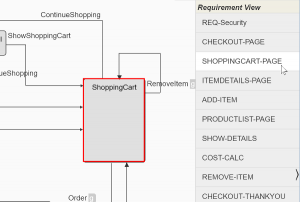
- Requirement View - highlight requirement coverage on model
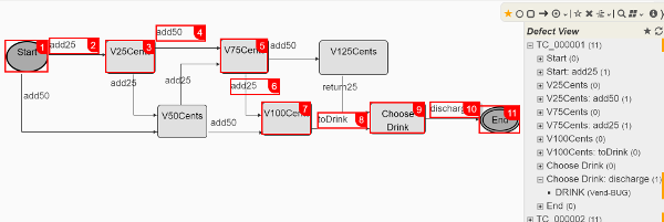
- Defect View - identify and trace to reproduce defects on model
- State Properties - state properties
- Transition Properties - transition properties
- Box Properties - box properties
- Swimlane Properties - swimlane properties
Modeling Canvas
Modeling Canvas consists of the modeling area, a tool pallet and view/property pane on the right when made visible.
Canvas has three modes matching mini button groups on tool pallet:
- Edit
- Add
- Mark
Tool Pallet
The mini buttons in tool pallet are divided into three groups:
- ★ edit / move states/transitions and edit properties
- ☆ mark / select states/transitions for set operations
- O add states and transitions
You will also notice that the background for the modeling canvas changes for each model: white, blueish and pinkish.
Creating New States
To create a state, select the state tool palette and click on the canvas to place the state.
There are several types of states offering different visual representation of the states, except the initial and final states. In general, visual shape of the states do not affect their function. Only the State Properties may change how state behaves, especially for the models to represent Concurrent System or Message-Drive Systems.
Moving States
Move states by drag and drop the state handler icon. The transitions connected to the state will move or re-route as necessary as the state moves.
You can move multiple states at a time by first Marking States. As you move any of the marked state, the rest of the marked states move with it.
Creating Transitions
Transition connects a source state to a target state. To create a transition, select transition mini-button and click on the source state and then click on the target state. You will be prompted to enter a name for the transition.
Positioning Transition Labels
Transition labels can be moved by clicking on the move handler icon, move mouse and click again to place the transition label. Drag and drop on the move handler icon also works.
Transition labels are positioned relative to the anchor point of the starting segment.
The text will auto wrap if it's too long for the text box. You can resize the text box by dragging on the resizer.
Routing Transitions
Transition consists of multiple segments that can be moved individually.
To move a segment, click the segment, move mouse and click again to place the segment. Alternatively you may drag and drop the segment.
Starting segment and ending segment connects to the side of the state. You may move the segment to the adjacent side of the state by moving the segment passed the bounds of the side of the state.
At times you may want to re-route (re-draw) the transition. There are two ways to do this:
- re-route transition with the same source and target states
- change transition source state and/or target state
You can accomplish this from the Context Menus.
Marking States / Transitions
There two ways to mark states:
- select mark mode and click on the states to toggle mark on the state
- drag a rectangle (lasso) to mark multiple states, it will automatically switch to mark mode
Context Menus
States and Transitions have contextual menus. To open the context menus, hover mouse over the state or transition label and click .
Menu items has hover title describing the action for the menu item.
State Menus
State menu:
- delete state,
- edit properties,
- toggle breakpoint,
- highlight incoming and outgoing transitions with different color and auto re-route all incoming and outgoing transitions.
Transition Menus
Transition menu:
- delete transition,
- edit properties,
- toggle breakpoint,
- re-route transition
- change source and/or target states
Tree View
Tree View displays states and transitions in a sorted tree view structure in the view panel on the right side of Modeling Canvas and allows you to quickly highlight (locate) the state and transitions on the model.
Requirement View
Requirement View allows you to identify where in the model (states and transitions) a requirement is covered.
Defect View
Defect View shows the defects that have been found in model execution and allows you to locate where in the model the defect was found and highlight the test path on the model to reproduce the defect.
By default, the defects from the current model execution is displayed. You may select a specific model execution in IDE Result to display the defects.
State Properties
- State ID - required, a unique identifier assigned to the state in the model
- Description - a freetext description
- Sub Model - sub-model attached to the state
- Color* - background color, custom class, or css style in json, e.g. {“background”: “yellow”}
- Text Color* - state label color, custom class, or css style in json, e.g. {“font-style”: “italic”}
- Activate Type - condition when state is activated. Concurrent Model only.
- Traversal Count - count of incoming transition traversals has reached the threshold
- Transition Count - count of transitions traversed has reached the threshold
- By Variable - user variable $VAR._ACTIVATE_'stateid' is set to true
- Sum of trans weights - sum of the weights from the incoming transition traversals has reached the threshold
- Threshold - threshold value for Activate Type
- Firing Trans - what outgoing transitions to be triggered when the state is activated.
- Random - randomly select one from all outgoing transitions, if transition has guard, the guard condition must evaluate to true
- All - all outgoing transitions are triggered
- By Variable - only trigger the transition named by user variable $VAR._FIRING_'stateid'
Custom class name must be styled in config/ide.css file.
Transition Properties
- Transition Name - a unique identifier assigned to the transition.
- Hide Name - not to display transition name on model and graphs
- Description - a freetext description
- Color - transition line segment color, custom class name, or css style in json, {“background”: “green”}.
- Text Color* - transition label color, custom class name, or css style in json, e.g. {“font-style”: “italic”}
- Weight - weight (importance), transitions with higher weight will likely be traversed more often by Random sequencer
- Traversal Required - minimum number of times the transitions must be traversed. Default 1. Set it to 0 for transitions are required to be traversed (tested).
- Guard - boolean expression, transition can not be traversed until this condition evaluates to true
- Guard Hint - a code / hint describing the guard
- Satisfying Hint - matching code / hint to resolve a guard of other transitions
- Response Max (ms) - maximum number of milliseconds when exceeded to add the traversal of this transition to the slow performance tally.
Custom class name must be styled in config/ide.css file.
Guard Hint / Satisfying Hint
When traversing the model, sequencers must deal with the transitions that fail due to guard conditions. All sequencer are designed to automatically resolve the guard failures by finding an alternate path. Most of the time this is sufficient. From time to time the sequencer may need some hints to resolve the guard failure or find better path to resolve a particular guard failure.
Hint is a code or series of codes assigned to transition guard, either as a Guard Hint or Satisfying Hing.
For example, the “checkout” transition has a guard with shoppingCartItems > 0. To resolve shoppingCartItems > 0, the “addItem” transition will satisfy shoppingCartItem > 0. To match “addItem” and “checkout” transitions, we would assign hint code of “ADDITEM” to “checkout” transition's Guard Hint and “addItem” transition's Satisfying Hint.
Multiple hint codes can be assigned (separated by comma) to transition as Guard Hint and Satisfying Hint. Any of the hint code will be sufficient to satisfy the matching transition guard and vice versa.
Box Properties
- Name - required, a unique identifier assigned to the box in the model
- Color* - background color, custom class, or css style in json, e.g. {“background”: “yellow”}
- Text Color* - box label color, custom class, or css style in json, e.g. {“font-style”: “italic”}
Custom class name must be styled in config/ide.css file.
Swimlane Properties
- Name - required, a unique identifier assigned to the state in the model
- Color - background color
- Text Color - label color
- Lane Color - background color
- Lane Text Color - lane label color
- Lane Size - height/width of the lane in px
Model Execution
There are three ways to execute the models:
- run - normal execution of the model
- debug - step through the model to debug
- play - visualize model execution synchronized with AUT / target process
This can be accomplished with the shortcut buttons:  :
:
- Run
- Stop
- Pause
- Step Over
- Debug - run and pause on initial state
- Play
Model execution can be monitored with Execution Monitor .
Log Files
There are two types of log files, they can be accessed via  :
:
- Model Log - log messages written out by your script using $SYS.log(…), accessible from Run menu and RESULT tab.
- Server Log - System log messages and errors, it only shows the message for the current model execution. Can also be accessed through Help Menu on application header next to TestOptimal version number and RESULT tab.


